The Scandinavian Club
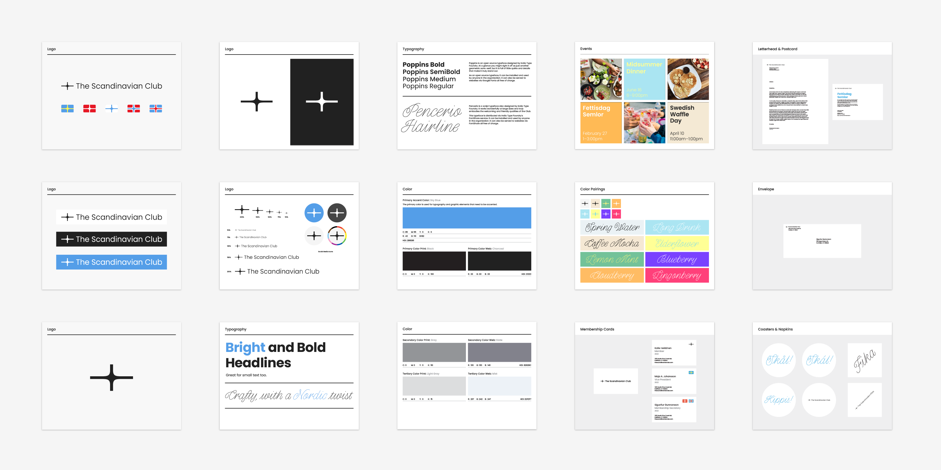
The Scandinavian Club (TSC) is a cultural organization in Fairfield, Connecticut. Unable to rent their event space during COVID, TSC needed to re-strategize how to generate revenue. I worked with TSC’s Board of Directors across 2 months to define their branding and marketing strategy. The following rebrand proposal highlights TSC as an inclusive organization at the forefront of Nordic culture abroad.